HARSHITA
All work01/052026
Blue Ashva Capital · Design Lead

A redesign of the Blue Ashva Capital website, and an accessibility audit of the site after launch.

Blue Ashva Capital is an Indian investment firm that works in venture capital and private credit. The work covered an audit of the existing site, a written set of recommendations, the content for ten pages, the redesign and the build, and an accessibility audit carried out with a screen reader once the site was live.

Visit blueashvacapital.com
Before
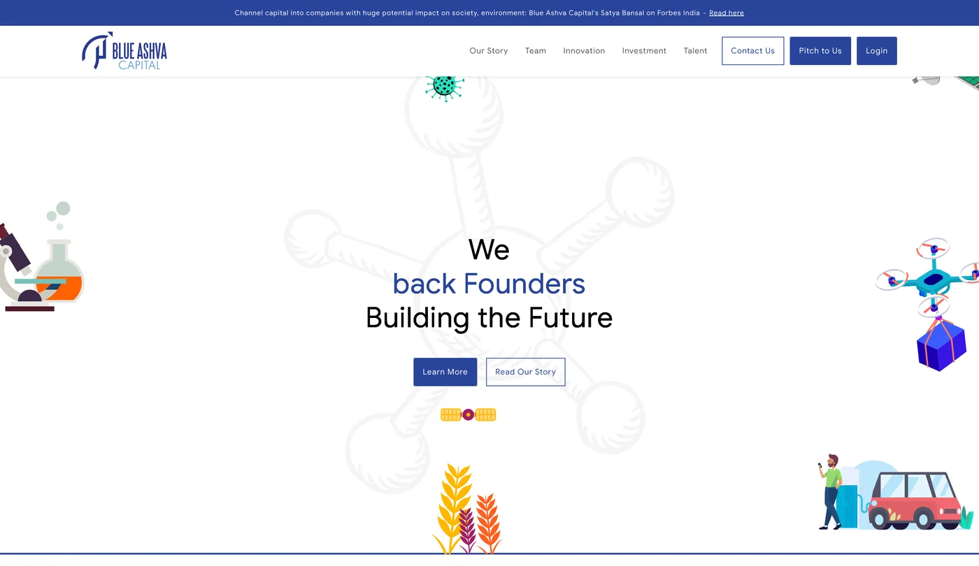
The home page, before the redesign
After
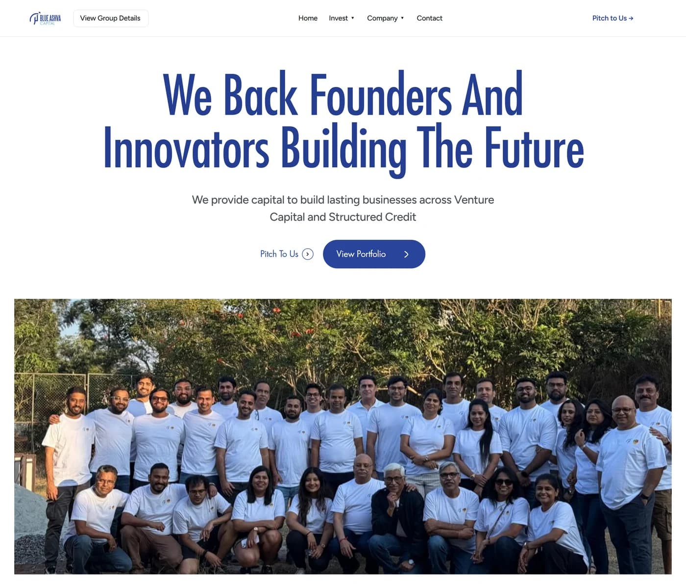
The home page, after the redesign
The home page. The previous version set the headline across three colours and placed stock illustration around it. The redesign uses one headline, one supporting line, two actions, and the firm's own photograph of its team.
Status
Live client website
Role
Design lead
Scope
Audit, IA, content, UI
Build
Framer with CMS
Evidence
Live site + WCAG audit

01The existing site

The site already contained the firm’s position. The page gave every element the same weight, so it was difficult to read.

Blue Ashva Capital works in venture capital and private credit. The firm's position, which is that it backs deep technology companies through the stage at which most capital stops, was already written on the site, but it was difficult to find. The navigation held eight links of equal weight, so the pitch action had no more prominence than any other item. The portfolio was shown as a grid of logos with a single category label and no description. Seventeen sector tags ran in one row and overflowed the page on both sides. Section headings were all set at weight 700, body text was about 15px at a line height of 1.4 to 1.5, and capitals were used in the navigation, the labels and the buttons at the same time. The work required was structural and typographic rather than editorial.

WHAT THE AUDIT RECORDED
  • ·Eight top level navigation links, with the pitch action given no more prominence than any other item
  • ·A portfolio shown as logos with a category label and no description
  • ·Seventeen sector tags in one flat row, overflowing the page on both sides
  • ·Every section heading set at weight 700
  • ·Body text at about 15px on a line height of 1.4 to 1.5
  • ·Capitals used in the navigation, the labels and the buttons at the same time

02Before and after

Each pair below holds one complete section of the site, before and after, at its full height. Nothing is cropped.

Before
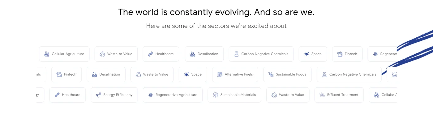
The sectors section, before the redesign
After
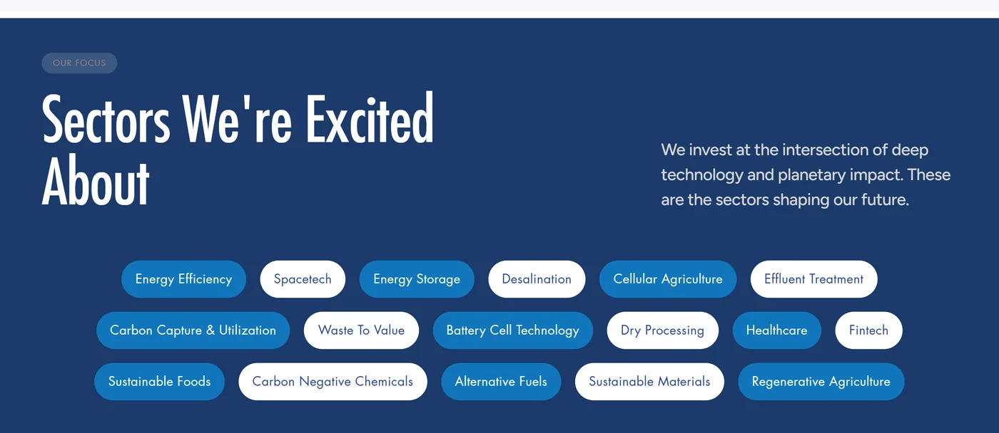
The sectors section, after the redesign
The sectors. The seventeen tags previously ran in one flat row that overflowed the page on both sides. They now sit in their own section, with an overline, a heading and two sentences describing what the tags have in common.
Before
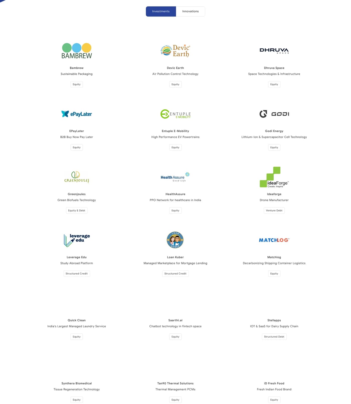
The portfolio section, before the redesign
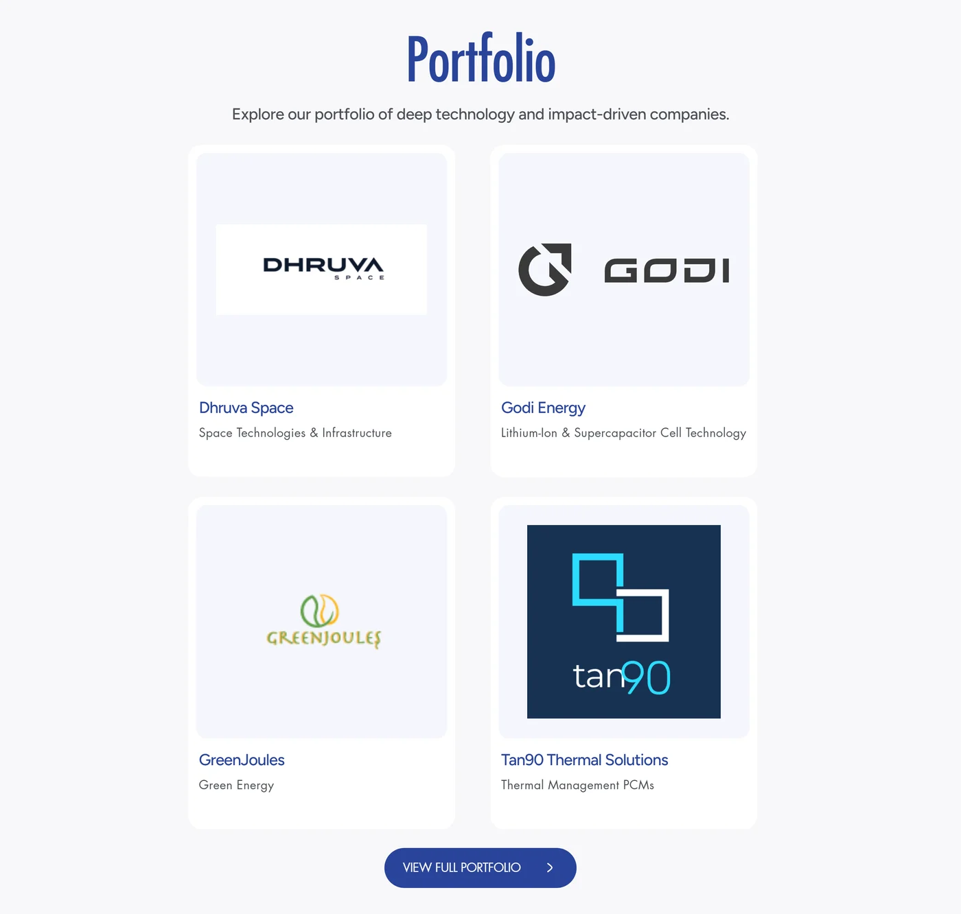
After
The portfolio section, after the redesign
The portfolio. The previous version listed eighteen logos on the home page with a category label and no description. The redesign shows a smaller set of cards, each with a line on what the company does, and the full list on a separate page.
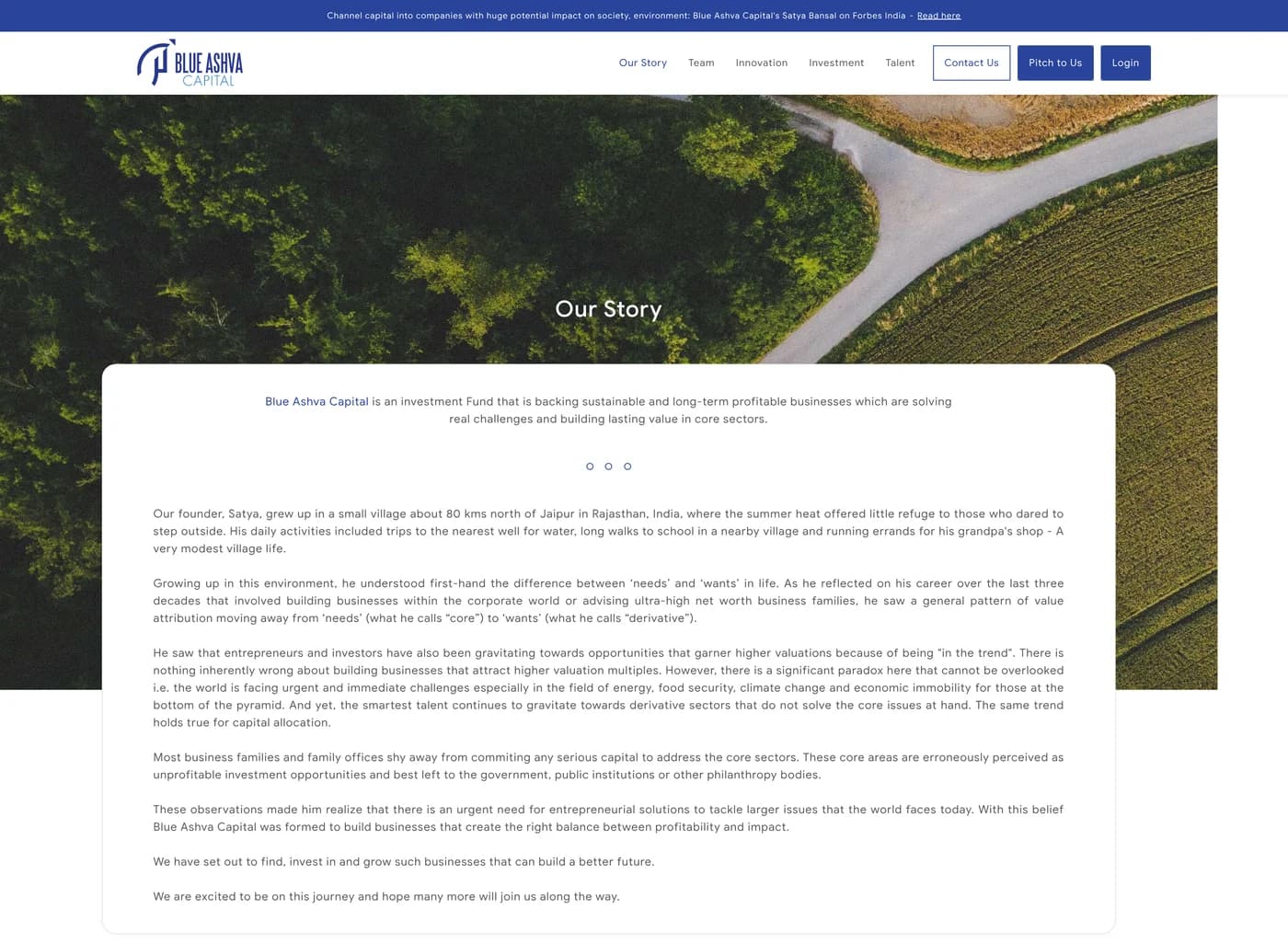
Before
The founder's story, before the redesign
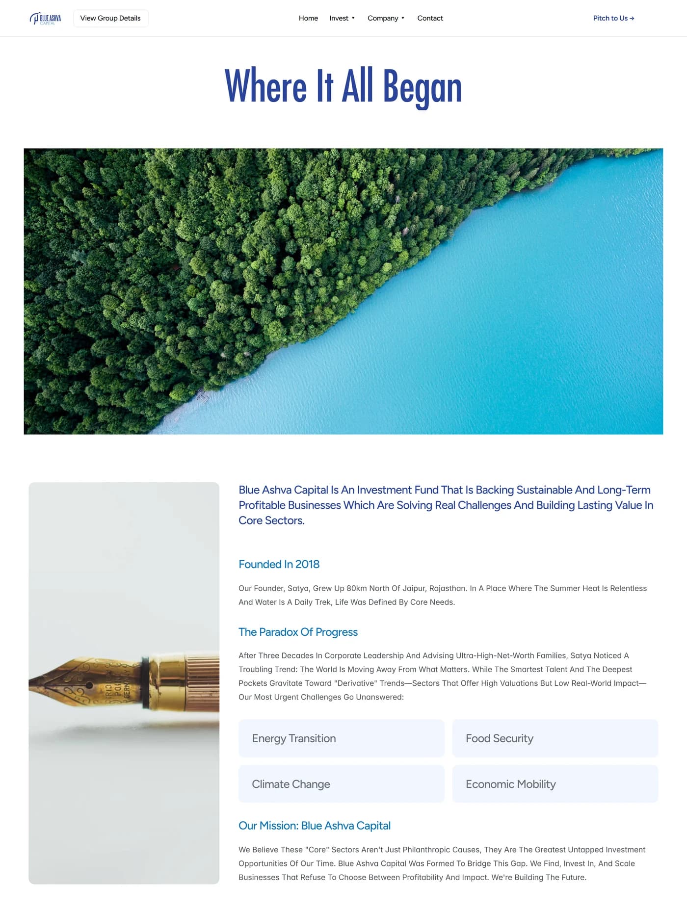
After
The founder's story, after the redesign
The founder's story. A single justified block of text set over a photograph was divided into named sections at a readable measure, with the four challenges it identifies set out as cards.

03Navigation

Before, 8 items
HomeVenture CapitalPrivate CreditPortfolioOur StoryTeamInsightsContact

With every item weighted equally, the pitch action competed with seven others, and the bar wrapped onto a second line on smaller screens.

After, 5 items
HomeInvestCompanyContactPitch to Us
Invest
Venture Capital, Private Credit
Company
Our Story, Team, Portfolio, Insights

04Type and spacing

The recommendations were written as values rather than as descriptions, so that the build did not have to interpret them.

PropertyBeforeAfter
Section heading weight700500
H1 size64 to 80px52 to 56px
H2 sizecompeting with H136 to 40px
Body sizeabout 15px16 to 17px
Body line height1.4 to 1.51.7 to 1.8
Capitalsnavigation, labels and buttonssection labels only
Section paddinguneven100 to 120px

05Key decisions

01

Reduce the navigation from eight links to five

Venture Capital and Private Credit were grouped under an Invest menu. Our Story, Team, Portfolio and Insights were grouped under a Company menu. Home, Contact and Pitch to Us remained at the top level. This leaves the pitch action as the only coloured item in the bar, and the navigation no longer wraps onto a second line on smaller screens.

02

Add a description to every portfolio company

A logo identifies a company only to a reader who already recognises it. Each card now carries a short description of what the company does, such as space hardware, phase change materials or second generation biofuels, so that a founder can understand the type of business the firm backs.

03

Move the sector tags into a section that explains them

The seventeen tags were taken out of the general page flow and placed in a separate section with an overline, a heading and two sentences describing the areas the firm invests in. The tags are grouped rather than run together in a single row.

04

Reduce the heading weights and open the spacing

Section heading weight was reduced from 700 to 500, and the H1 was reduced from a range of 64 to 80px down to 52 to 56px. Body text was set at 16 to 17px with a line height of 1.7 to 1.8. Capitals were limited to section labels only. Section padding was standardised at 100 to 120px at the top and bottom of each section.

05

Specify the motion, and allow it to be turned off

Sections fade in over about 0.4 seconds with a short upward movement as they enter the viewport, with a stagger of about 0.1 seconds within a group. Content above the fold does not animate, nothing loops, and the data visuals are left static. All animation is disabled when the reduced motion setting is enabled in the operating system.

06

Write the page content before designing the pages

A content reference was written for all ten pages, including a new Group page that sits above the Capital site. Deciding what each page had to say first made the layouts easier to settle. Once each portfolio company had a description, the structure of the card followed from it.

07

Test the site with a screen reader after launch

The live site was tested with NVDA in Chrome against WCAG 2.1 Level AA. Each finding was recorded with the page, the success criterion, the user groups affected, a screenshot and the markup required to fix it.
06The accessibility audit

Once the site was live it was tested with NVDA in Chrome against WCAG 2.1 Level AA. Sixteen findings were recorded on the Capital site and nine on the group’s Blueprint Ecosys fund site. Each finding was recorded with the page, the success criterion it fails, the user groups it affects, a screenshot and the markup required to fix it.

Blue Ashva Capital, 16 findings, NVDA in Chrome
PageWCAGFindingAffects
Home2.4.1No skip to main content linkMobility
Home2.4.1Main landmark not definedBlind, Mobility
Home1.1.1Logo alt text reads IconBlind
Home1.1.1Alt text applied to decorative iconsBlind
Home1.1.1Portfolio logos missing alt textBlind
Home2.4.4Link text Group is not descriptiveBlind, Cognitive
Home4.1.2Active navigation link not identifiedBlind
Home1.3.1Navigation not marked up as a listBlind
Home1.3.1Section titles styled but not marked as headingsBlind
Home1.3.1h5 used for higher level headingsBlind
Home1.4.3Standard text below 4.5:1 contrastLow vision
Home1.4.10Portfolio content cut off on reflowLow vision
Home1.4.12Portfolio content cut off with text spacing appliedLow vision
Venture Capital2.4.2Identical page title used across every pageBlind
Our Team1.3.1Team links not marked up as a listBlind
Pitch3.3.2No instruction explaining the required field asteriskBlind, Cognitive
CLOSED ON THE LIVE SITE
  • Descriptive link text. Group is now View Group Details
  • A main landmark on every page
  • aria-current on the active navigation link
  • A unique, page specific title on every page
  • Correct alt text on the logo, and none on decorative icons
  • Heading levels corrected
STILL OPEN
  • ·The skip link is present but does not yet target the main content
  • ·The primary navigation is still not marked up as a list

These two items are recorded here because they have not been fixed yet.

07The pages

Five of the ten pages, each shown end to end at its full length.

/
Home. The hero, the portfolio, the sector focus section and the guiding principle.
/venture-capital
Venture Capital. The Valley of Death thesis at the full content width, five focus areas as cards, and the platform figures separated by a rule.
/private-credit
Private Credit. The financing products as a numbered card row, with the strategy and the investor fit separated so that they read apart.
/portfolio
Portfolio. The page title is now specific to the page, and the founder facing copy sits in the hero rather than below a section heading.
/our-story
Our Story. The founder's account divided into named sections, followed by the letters from the founder.

08Handover

The client needed to be able to update the site without a designer.

The site is built in Framer. The parts that change most often, which are the team, the portfolio companies and the insights posts, are held in CMS collections rather than in the layout, so adding a new team member or a new portfolio company is a matter of filling in fields and publishing. The project was handed over with a written management guide covering the editor, the collections, adding and editing items, drafts and published items, and publishing changes to the live site.

CMS COLLECTIONS
  • Team
    Name, title, photo, LinkedIn, order
  • Portfolio
    Company, sector, description, logo, instrument
  • Insights
    Title, slug, cover, body, date

09Outcome

The site is live at blueashvacapital.com. It has ten pages across the Capital site and a new Group page above it, and the firm can publish updates to it directly.

The accessibility audit recorded sixteen findings on the Capital site and nine on the group’s Blueprint Ecosys fund site, each mapped to a success criterion.

Most have since been closed on the live site, including descriptive link text, the main landmark, aria-current on the active navigation link, unique page titles, corrected alt text and corrected heading levels. Two remain partly open. The skip link is present but does not yet target the main content, and the primary navigation is still not marked up as a list.

10 pages, one CMS 8 navigation items reduced to 5 16 findings, WCAG 2.1 AA
Visit the live site

10What I learned

Sources and research basis

Next project
Fixit