Appeal.
An AI tool for contesting a denied health-insurance claim. The user photographs the denial letter; the app explains the real reason in plain language, sets out the grounds for an appeal — each cited to the user’s own documents — and helps draft a letter the user edits and sends.
View the prototype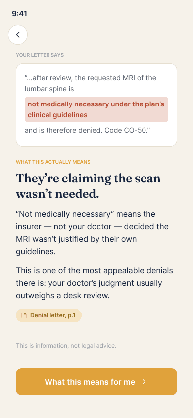
- Status
- Independent concept
- Role
- Product designer
- Methods
- Policy research, systems
- Prototype
- Interactive iOS system
- Validation
- Expert review proposed
The problem
Most denied claims are never appealed — not because they lack merit, but because the process is made opaque and exhausting.
“What does this even mean — do I have a case, and what am I supposed to say?”
EXHIBIT 02 — WHERE EXISTING TOOLS FALL SHORT
Letter generators produce a document full of claims the user cannot verify, and some imply that they act as a lawyer.
The cautionary case is a service whose regulatory settlement describes exactly what to avoid: untested advice, fabricated documents and overstated authority.
The approach
The aim is to address the part no existing tool owns: helping the user understand the denial and judge whether they have a case, before any letter is written.
The design is built on traceability and honest confidence — every claim is tied to a source the user can check, the strength of the case is stated plainly, and the user remains the author of the appeal throughout.
The method
The real reason, in plain language.
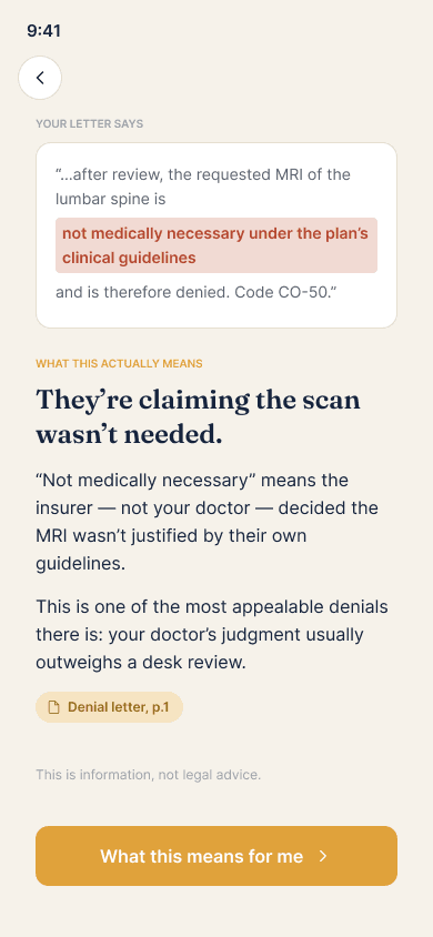
The user’s own letter is shown with the decisive clause highlighted, beside a plain-language explanation of what it means. Where a denial gives no stated reason — the largest category — that absence is itself presented as a basis for appeal.
highlighted in the user’s own letter
A verdict that can be checked.
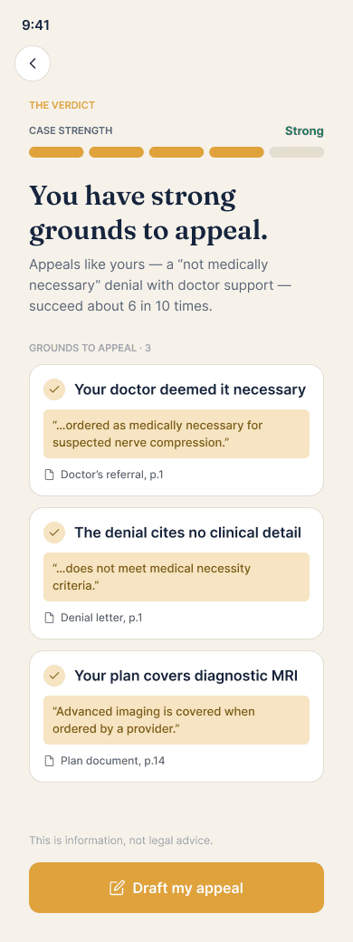
The verdict pairs a calibrated strength estimate with an honest base rate, and every ground carries a citation that traces back to a specific line in the user’s documents or a named regulation.
every ground cited to a source
The rest of the file
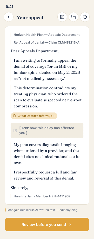
The draft: an editable appeal in the user’s name, with AI-written passages marked and each point linked to evidence.
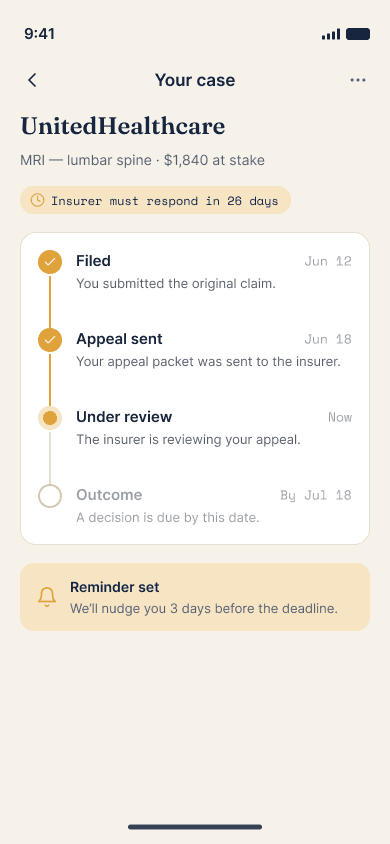
The case timeline — filed, sent, under review, outcome — showing the current stage and the next step.
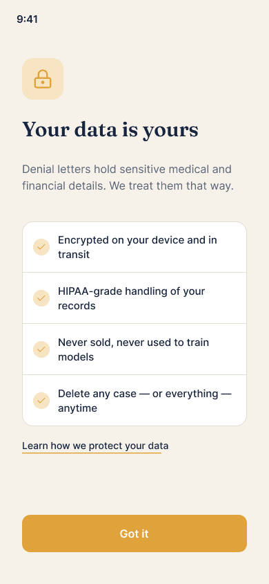
Data handling is local-first and made clear to the user before any information is requested.
Key decisions
Confirm what was read before building on it
After the letter is read, the application does not proceed silently. It displays the extracted fields over an image of the user’s letter; tapping a field highlights its source. Low-confidence reads are marked for confirmation, and nothing downstream relies on an unconfirmed value, which keeps every later citation dependable.
Translate the real reason into plain language
The central screen presents the user’s letter with the decisive clause highlighted, alongside a plain-language explanation. Where a denial gives no stated reason — the largest single category — that absence is itself presented as a basis for appeal rather than a dead end.
A calibrated verdict, supported by citations
The verdict combines a strength estimate with an honest base rate, and every ground is accompanied by a citation that traces to a specific line in the user’s documents or a named regulation. Weak cases are described as such, and genuinely complex matters are referred to a lawyer or advocate.
The user remains the author and sender
The appeal is presented as an editable letter; passages written by the system are marked, and suggested changes are offered as accept-or-reject edits. A review step is required before sending. This keeps the user in control and draws a clear boundary: the tool assists, but does not act as a lawyer.
The decode is never behind a paywall
Understanding the denial and seeing the available grounds is always free; payment applies only at the point of sending, and a hardship path provides full access. The intent is to avoid charging people at their most vulnerable.
Design system
One set of tokens and shared components runs through the product, so a citation, a verdict or a strength estimate reads the same way on every screen.
All 78 screens are connected into a single flow — capture, the decode, the cited verdict, the draft editor, send-and-track, the evidence locker, privacy and the edge cases — that can be navigated from start to finish.
What it is
Appeal is a concept: there are no real users, no launch and no shipped metrics. It is a complete, coherent system — 78 screens across 19 flows covering capture, the show-your-work decode, adaptive intake, the cited verdict, the editable draft, send-and-track, the evidence locker, deadlines, guidance, escalation, account and security, privacy controls, the paywall, and the full set of edge and error states — all built from a single design system, with traceable citations and calibrated confidence at its centre. A meaningful evaluation would be an expert review: whether a patient advocate would accept that it helps a layperson understand and contest a denial without overstating its role.